
Accessibility in Word
Creating an accessible Microsoft Word document starts in Word itself. Use Word's built-in structure and accessibility features as you build the document, rather than waiting until export.
If you plan to export the document to PDF, make sure the Word file is accessible first. A clean export preserves much more of your work and reduces the amount of remediation needed later.
Using the Accessibility Assistant
Word's Accessibility Checker is a useful starting point, but it does not catch every issue. You should still review the document manually for structure, readability, images, tables, color, and document properties.
Open the Accessibility Assistant pane
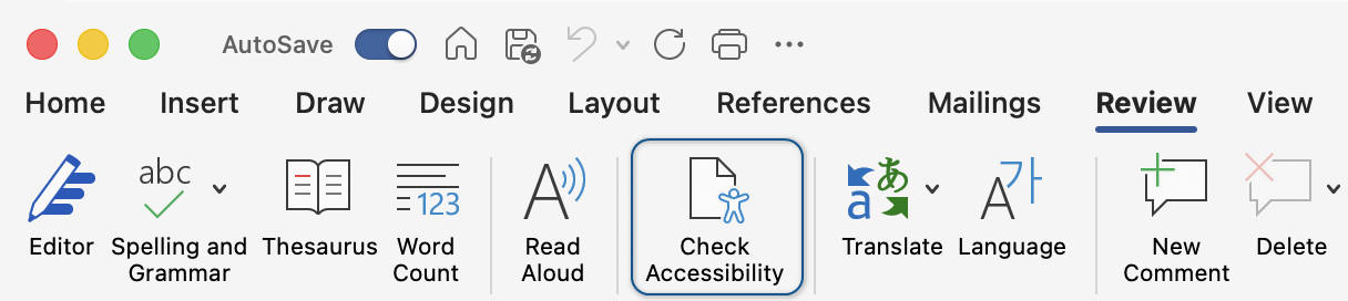
On the Review tab, select Check Accessibility. If you use it often, you can also add it to the Quick Access Toolbar. (opens in new tab)
Review errors
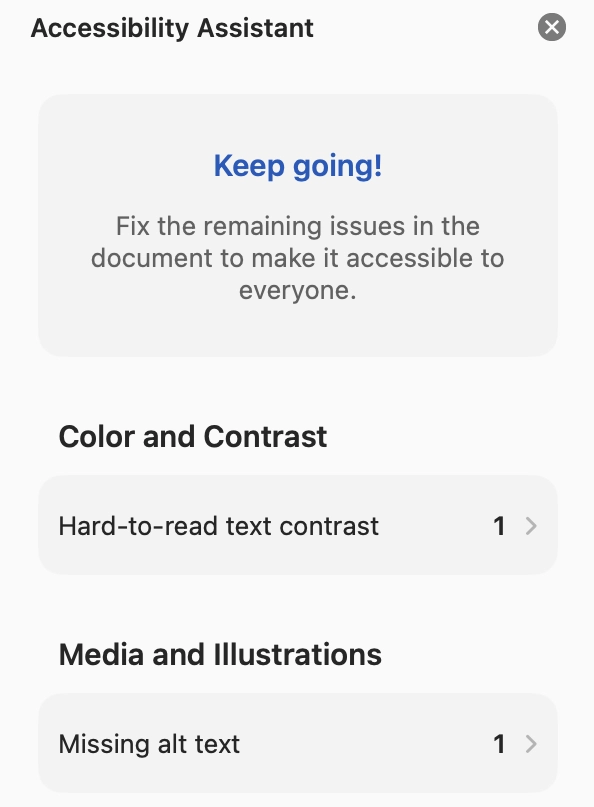
When the Accessibility Assistant pane opens, review each issue listed in the sidebar. Category names and labels may vary slightly by app version. Select an issue in the pane or select the accessibility issue icon in the document margin to learn what the problem is, why it matters, and how to fix it.
Download the practice document and use the Accessibility Checker to identify and fix common errors. Remember, the automated checker does not catch every accessibility issue. Manual review is still required. Review issues using the Microsoft Word Accessibility Testing Checklist.
Text considerations
Keep your text clear, legible, and in plain language. Here are some common considerations for your text when making your document:
- Use a minimum font size of 12 pt.
- Use sans serif fonts for body text.
- Avoid using all capital letters for words or phrases, other than abbreviations.
- Use live text instead of images of text whenever possible, except for items such as logos.
- Avoid using text boxes for body content. Keep text in the main document flow whenever possible.
- Spell out abbreviations the first time they appear, even if they are common.
- Avoid using symbols such as &, #, and % to replace words in sentences.
- Don't adjust character or line spacing to be smaller than the default.
- Reserve underlining for hyperlinks only.
- Use Word's built-in spacing and layout tools instead of using repeated spaces, tabs, or blank paragraphs to control layout.
Sensory language
In addition to using plain language, to be more inclusive, try to avoid "sensory language." Some people navigating your content won't be able to see, hear or click. Using "select" instead of "click" is also appropriate since many people will be accessing your content on a mobile device.
Instead of using phrases like "see your account" or "listen to a podcast about finding a job," use interchangeable words like:
- View
- Review
- Explore
- Find
- Discover
Also be careful of using only visual or directional language. For example, if you are writing instructions on how to remove a row from a list or table on a webpage, don't use phrases like, "to remove a row, select the blue trashcan on the right." People with colorblindness or low vision may not be able to identify the color blue, or the icon. People using a screen reader will hear the button name, which in this example is likely "delete" or "remove," rather than "trashcan." Depending on whether your content is viewed on desktop or mobile devices, it's possible content could shift and not be "on the right." Instead make sure to include the specific button name when describing it, such as "select the delete button, which is the blue trashcan icon."
Link accessibility
Use descriptive link text and keep hyperlink styling consistent. In most Word documents, links should remain underlined, so they are identifiable without relying on color alone.
| Avoid | Use |
|---|---|
| Click here | Find a fishing spot |
| Read more... | Tunnel restoration and closure |
| Learn more... | Learn more about early childhood education |
Someone using a screen reader can navigate by jumping between links in a document when scanning the content. If they come across six links that only have the title "click here," they won't know where those links go without navigating backward and listening to the block of content surrounding the link.
Avoid using entire URLs as well, as in:
https://www.mass.gov/topics/early-childhood-education-care
Links like that are a lot to listen to from a screen reader perspective. Additionally, links to external sites might contain a mix of letters and numbers that don't mean anything. Instead, hyperlink descriptive text whenever possible.
If a document is meant to be both printed and provided digitally, we recommend the following to maintain the accessibility of the hyperlinks while providing the URL information to those who may receive a printed copy of the document:
- Hyperlink descriptive link text
- In parentheses or brackets, provide a shortened URL. Do not link the URL text.
For example:
- Accessibility Center for Consulting, Education and Support Services (mass.gov/eotss-access)
- Procurement of Accessible Digital Products and Services [tinyurl.com/yc76curx]
What about QR codes?
QR codes are handy for documents meant to be printed and shared. QR codes can be frustrating when they're placed in a document meant to be downloaded and read on a digital device where live hyperlinks are expected. If you must add a QR code to your document, the general best practice is to include both linked text and a shortened URL in addition to the QR code, which is marked as decorative. The linked text identifies where the QR code leads and provides an alternate way to get to the resource. The shortened URL (unlinked) provides another way to access the resource that doesn't require a secondary device nor knowledge of how to use a QR code.
Review the following example:

As with all hyperlinks, please confirm the accessibility of the resource you're linking to.
Proper document structure
When you review a document, headings and other built-in structures help you understand how content is broken up and allow you to skim the document and find the content you are looking for. In Word, use built-in styles and formatting tools for structure rather than relying on visual formatting alone.
Headings
Headings often appear as text that is bold or larger than the body text. The visual style of headings doesn't have any accessibility requirements beyond standards for text and color contrast. They can look however you want to design them. However, the proper paragraph formatting should still be applied using the Styles Pane.
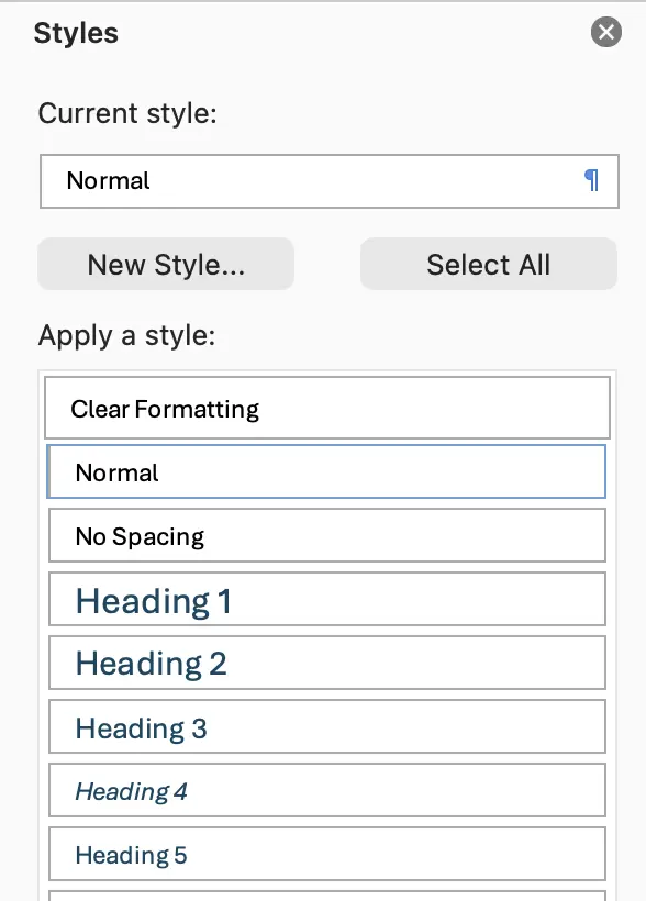
In the Home tab, select the Styles Pane. With your heading text selected, choose the appropriate style from the list.
You will find a Title style, as well as Heading styles for levels 1 through 6. The Title style does not function as a heading and should not be used. Use Heading 1 for the top level of content in the main body of your document. If your document is more than a few pages, it is recommended to include a table of contents (opens in new tab), which can be created automatically based on the headings in your document.
Important: In most documents, there should be one Heading 1 in the main body of the document.
Heading 1 represents the top level of content in your document. Each subsequent heading is like an indentation in an outline. You will likely have multiple Heading 2s in your document, as those will occur with each new section. Heading 3 is below Heading 2, and so on. Never skip a heading level. For example, never have a Heading 1 followed by a Heading 3.
Here's an example of a simple heading outline for a Massachusetts travel guide:
- H1 - Welcome to Massachusetts
- H2 - The Berkshires
- H2 - Boston
- H2 - The Cape
- H3 - Cape Cod National Seashore
- H3 - Chatham
- H3 - Provincetown
- H4 - Restaurants
- H4 - Entertainment
- H3 - Yarmouth
- H2 - Martha's Vineyard
Heading structure may be more complex, depending on how much content is on a page. It is important not to skip heading levels. Don't choose your headings based on how the text looks. If you want to change how the heading text looks, you can do so without changing the heading level in Word. The following are correct and incorrect examples of heading order.
Correct heading formatting
- H1
- H2
- H2
- H3
- H2
- H3
- H4
- H2
Incorrect heading formatting
- H1
- H2
- H4 Incorrect
- H4 Incorrect
- H2
- H5 Incorrect
- H3 Incorrect
Modifying styles
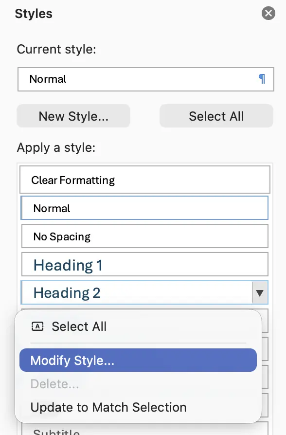
Don't choose headings based on how text looks. You can modify the look of headings in your document while keeping the correct formatting level. To modify a style, select the drop-down arrow next to a style name and choose Modify Style...
Lists
It's important that any lists in your document are actually formatted as lists. Word offers bulleted, numbered, and multilevel lists like outlines.
Typically, Word will automatically format lists for you. Once you begin typing in a list style, such as 1. or a., Word will often detect that you are starting a list and apply the associated list formatting. You can then use the Tab and Shift+Tab keys on your keyboard to promote or demote indentations in your list. Do not use spaces or the ruler to indent levels in lists.
There are three common list mistakes to be aware of: copying and pasting lists, deleting the line-item number and typing something manually, and using an empty paragraph between list items to create space between the items.
If you need to add space between your list items, use the Paragraph settings to increase space either above or below each list item rather than using the Enter key to create that space. Empty paragraphs between list items can cause assistive technology to view each list item as a separate list.
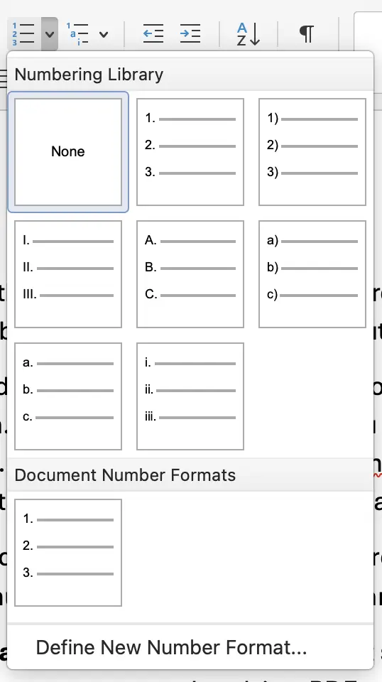
When pasting a list into Word, it may not carry over proper formatting. To ensure list formatting, place your cursor on a list item. In the ribbon, you will see one of the list style buttons highlight if it is using list formatting. If it does not, highlight your list, and select the button for the list style you want.
Make any changes to the list style with the list dropdown. While it may be possible to manually change a list style by erasing a number and typing in the list item label itself, that process can allow you to enter a style that will not automatically format and can break the structure of your list. Avoid non-standard bullet or number characters in your lists. Only use the styles provided and do not use emoji in place of list characters.
Columns
It is best to limit the use of text columns in documents. As many users will be adjusting the font size in a document, multiple columns can make content awkward to read or may even be ignored. For example, in Word, with a two-column layout at 24 pt font, there are generally only three or four words per line. For a PDF, Acrobat has a "Zoom Reflow" option, which will remove columns and place the text in a single-column layout, though this can cause lines to be divided mid-word or punctuation to be moved to another line.
If you must use columns, use them only in limited sections of your document, and don't use more than 3 columns.
Headers and footers
Document headers and footers are commonly skipped over by a screen reader. While content in the header or footer of a Word document appears visually separate from the main content, if it were always read by a screen reader, it would be interjected mid-sentence at the beginning and end of every page without context.
Because of that, pertinent information should not be placed in the header or footer. If it is repeated information already found prominently in the document, such as the author, document title, or chapter title, that is okay, but it should not be the only place where that information is found. Ensure that important repeated content in your header or footer exists once directly on the page once in the document outside of the header or footer.
Page numbers
By default, page numbers are placed in the header or footer. This is expected and is often the only unique information in the header or footer.
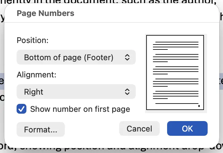
Make sure to add page numbers properly:
- Select the Insert tab.
- Select Page Number.
- Choose a location, and then choose an alignment style.
Text spacing
A frequent habit in Word document authoring is to use the Enter key to create vertical space in a document, either between paragraphs or on a cover page of a report to center the title vertically. This practice is fine for occasional spacing, but excessive use of empty paragraphs can be problematic for those using assistive technology like screen readers. A better practice is to use the Paragraph tools in the Home and Layout tabs, or a page break.
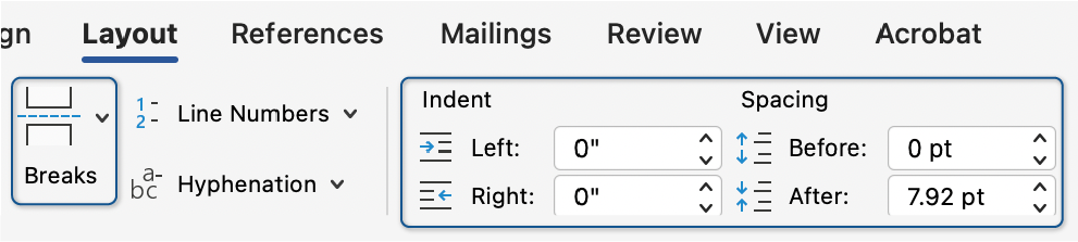
To create vertical space before or after a particular line of text, place your cursor in the line of text in question, go to the Layout tab, Paragraph section, Spacing tools, and use the arrows to increase the space before or after the text. Alternatively, in the Home tab, expand the Paragraph settings, go to the Indents and Spacing tab and adjust the Before or After spacing in the Spacing section.
To create vertical space for the rest of the page, place your cursor where you want the page to end, and in the the ribbon, select the Insert tab then select Page Break
Images
When adding images into a Word document, it's important to remember two key factors: set the text alternative (alt text) and make sure the image is set to In Line with Text.
Adding alt text
When you add an image to your document, Word may suggest auto-generated alt text. Review that suggestion carefully and revise or replace it as needed.
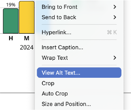
To add alt text in Word:
- Right-click the image you have added.
- In the context menu that appears, select View Alt Text...
You can also access this option by selecting your image, then Picture Format in the ribbon. Then select Alt Text from the ribbon.
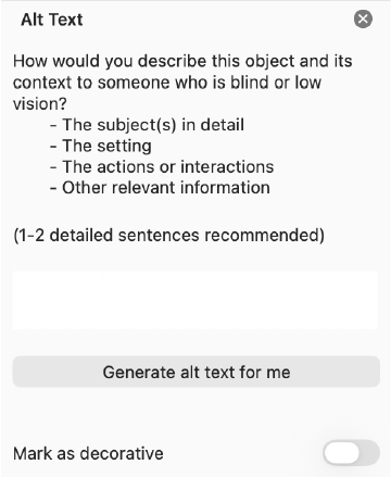
Word's Alt Text panel will open. Initially, it will have the auto-generated description in the text box. Remove that and write the appropriate description for your image.
If your image is purely decorative, such as a pattern or background shape, select Mark as decorative.
Most of the time, your images will not be decorative and should have proper alt text. Learn more about writing good alt text.
Setting images in line with text
In Word, inline images are the recommended default. Floating images can be read out of order or lose context for assistive technology, so use In Line with Text unless you have a strong design reason not to.
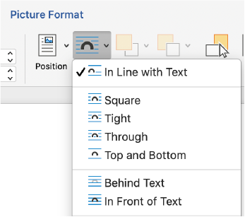
To make sure your image is in line:
- Select your image
- Select Picture Format in the ribbon
- Select the Wrap Text tool in the ribbon
- Select In Line with Text
If you use floating images, test the reading order carefully after export and be prepared to remediate the PDF in Acrobat Pro if needed.
If you are creating a document that needs a floating layout, such as an infographic, that will require additional steps. You will need to export your document to a PDF, then open that PDF in Adobe Acrobat Pro and use the accessibility tools to add alt text and adjust reading order.
Learn more about remediating PDFs in Acrobat Pro.
Color
Your document must follow the two most important rules of color: do not use color alone for meaning and ensure proper color contrast.
Not using color alone for meaning means that you'll need to include an additional way to identify what a color represents. For example, don't just use the color red to indicate bad and the color green to indicate good without including either text or a symbol to indicate it as well. For example, do not rely on green to mean "pass" and red to mean "fail" by themselves. Pair color with visible text (e.g., Pass/Fail), labels, or another clear indicator.
To ensure proper color contrast, you must make sure that your text has a strong contrast with its background. Typically, this means a 4.5:1 contrast ratio between text and its background. Large text and non-text elements may use a lower contrast threshold, but body text should generally meet the 4.5:1 ratio.
Tables
Tables are a common and useful way to compare data. Because of the way tables are handled by assistive technology, there are a couple of important dos and don'ts to remember. Most importantly, only use tables when absolutely needed. If you have data that needs to be compared, like a comparison matrix, or your data is numerical and will show mathematical relationships, use a table. If your content is just a list of information, or if you are trying to lay out text side by side that is not being compared, it is not recommended to use a table.
Do:
- Make sure that your table is added using the Insert menu.
- Include headers in your table.
- Check the table with the Microsoft Accessibility Assistant.
Don't:
- Don't use the Draw Table feature to add a table, as it creates a table that cannot be used properly with assistive technology.
- Don't use tables for design/layout of images or text.
- Don't add empty cells to your table for style or layout. This creates a lot of steps to navigate with a screen reader or keyboard.
- Don't use merged or split cells.
- Don't "nest" tables - don't put one table inside of another or use headings to break up sections within a single table.
- Don't use special characters to abbreviate words in a header (&, #, %)
Insert a table
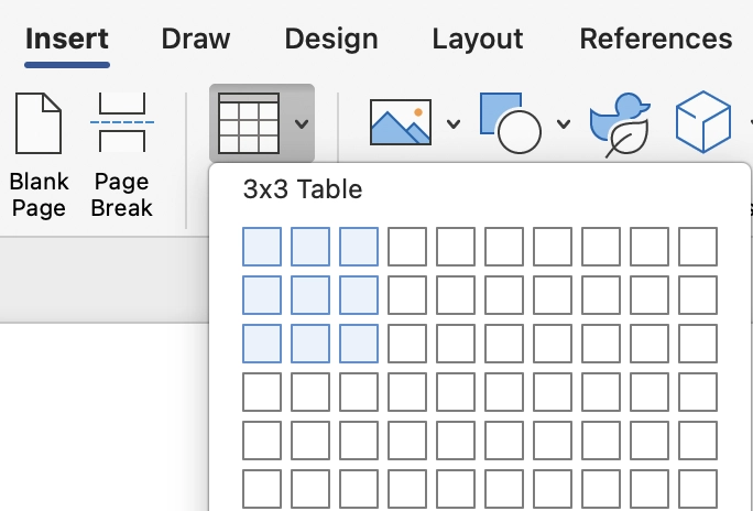
In Word, select the Insert tab on the ribbon. Then select the Table button. This will open a grid so you can choose the number of rows and columns or choose Insert Table from the Table menu. If you need more columns or rows later, you can still add them to your table through the right-click menu or the Table Design tab.
Add a header row
Table headers are not the same thing as headings in a document. A table header row defines the categories for each column. Though this is referred to as a "header row" in Word, because it categorizes each column, you may find it referred to on the web as "column headers." When a screen reader user enters a table, if headers are present, those categories will be announced as the table is navigated. If no headers are present, the top row of your table is treated as regular data cells.
By default, the first column in your table will also act as a header for each row of the table. As a screen reader user navigates the table, each cell from B2 (second row, second column) on will be categorized by the header row at the top, and the first cell in column one. Screen readers use header information to identify rows and columns, so it is important to define the header row rather than relying on visual formatting alone. If your table also uses row labels in the first column, keep those labels clear and consistent.
Avoid having symbols alone in your header, such as # or %, and instead write out "number" or "percentage."
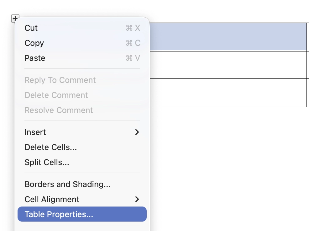
To add a header row to your table, right-click the top row in your table, and choose Table Properties... from the right-click context menu. This opens the Table Properties panel, which you can use to change settings in your table.
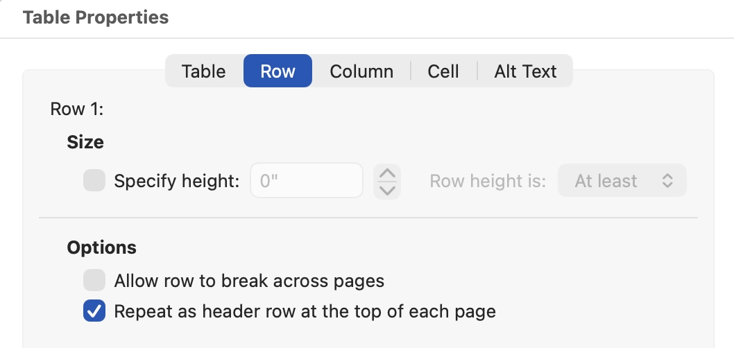
In the tabs at the top of the Table Properties panel, select the Row tab. Under the Options section, uncheck Allow row to break across pages. Then check the box next to Repeat as header row at the top of each page. In some versions of Word, you may also see a Repeat Header Rows command in the Table Layout tab.
Add alt text to the table
As a best practice, alt text can be used to give a general description of the content in your table. A screen reader user can't "preview" an entire table at once, they must listen to the description for each header and cell. Alt text can be used to give a general description of the content in your table, or, if there are important trends in the data, to highlight that.
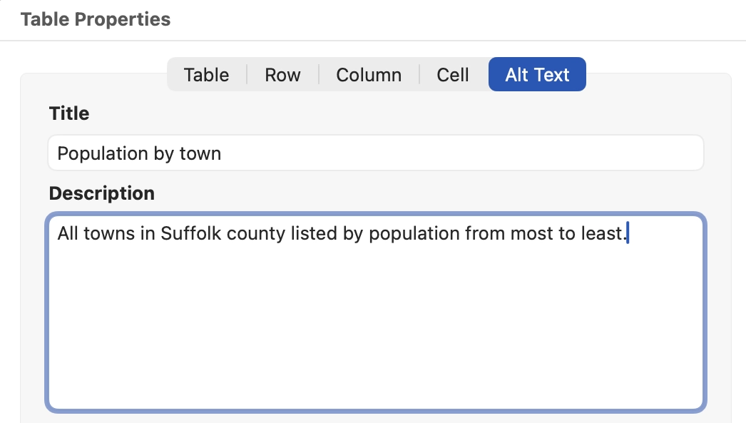
In the Table Properties panel, select the Alt Text tab. In the Title field, provide a brief, descriptive title for your table's content. Then add a short Description for your table describing the content. This is also the place where you could describe any important trends in the data, if applicable. It is best to keep this description to only a sentence or two. Word's Accessibility Checker may not flag a table that is missing alt text, so this is still worth checking manually.
Add a visible caption
Captions are useful visible titles that can appear above or below the table. Though not an accessibility requirement, adding captions enhances the accessibility and usability of the table. You can add any text you want to a caption, but it should be similar to your title. In most cases, Word will automatically add something like "Table 1" to your title. This is useful if your document includes multiple tables, because Word can use captions to build a table of figures. (opens in new tab)
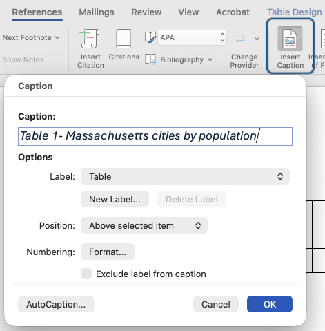
Select the References tab. Make sure the table is selected, then select the Insert Caption button. This opens the Caption panel. In the Caption field, add a descriptive title to your table.
Setting the language in a multilingual document
By default, Word will use your default proofing language. If you are creating a document that contains multiple languages, it is important to identify those passages of text as the correct language. This helps the spell checker be more accurate and helps make sure that a screen reader pronounces the text more naturally.
- Highlight the text that is in a different language.
- Select the Review tab.
- Select Language.
- Select Set Proofing Language.
- Choose a language from the list.
- Select OK.
If your document uses more than one language throughout, Word also includes a Detect Language Automatically option in the Set Proofing Language dialog. Please be aware that this auto detection can sometimes make errors. Always manually check the language of your whole document and multilingual passages.
Filename and document title
Filenames
Filenames for documents should be brief and easily identify what the document is about. Avoid the use of special characters (&, %, #) in filenames other than a hyphen (-).
If a document is uploaded to a website for download, the filename should include hyphens instead of spaces. For example:
Do: Unemployment-Application-2024
Don't: Unemployment Application 2024
Why? While you can upload a filename with spaces in it, when it is downloaded, it will automatically have the characters "%20" added in place of the spaces. This is because web addresses can't contain spaces.
Example filename: Unemployment%20Application%202024.doc
That can make the experience confusing for a screen reader user, and it can also make numbers like the 2024 date in this filename seems as though they have additional numbers attached to them. Hyphens are generally not announced by a screen reader unless certain settings are enabled. However, do not use underscores (_) in filenames, as those are announced by a screen reader, and can be a distraction.
Document title
A document title should be added to the document properties. This title carries through to an exported PDF as well.
Add a title in Word for Windows
- Select the File tab.
- The Info screen will appear.
- Under Properties, enter your document title. This title should use spaces and not hyphens.
Add a title in Word for Mac
- Select File in the menu bar.
- Select Properties...
- Select the Summary tab.
- Enter your document title. This title should use spaces and not hyphens.
Exporting to PDF
Most of the time when sharing a Word document, you will export it to PDF to make sure the document appears the same for all users. It is important to follow the guidelines on this page to ensure your PDF output is as accessible as possible. Never "Print to PDF." When you "print to PDF," the PDF loses all of the accessibility work you added to the original source document in Word. There are also a few final steps when exporting to PDF. Before saving your file as a PDF, run the Accessibility Checker and use Word's PDF save or export options so accessibility tags can be preserved in the PDF.
Export a PDF in Word for Windows
- Run the Accessibility Checker one final time and address any issues it identifies.
- Select File, then select Save As or Save a Copy.
- In the document type dropdown, select PDF (*.pdf).
- Select More options...
- Set the radio button for Optimize for: Standard (publishing online and printing).
- Select the Options... button.
- In the Options panel under Include non-printing information, check the box for Create bookmarks using: Headings and make sure Document structure tags for accessibility is checked.
- Select OK.
- Select Save.
Export a PDF in Word for Mac
- Run the Accessibility Checker one final time and address any issues it identifies.
- From the File menu, select Save as...
- In the dialog, change the File Format to PDF.
- Select Best for electronic distribution and accessibility (uses Microsoft online service).
- Select Export.
Advanced technique: Using columns and decorative shapes to mimic the appearance of a floating layout or text boxes
Sometimes it may be necessary to have the look of a floating layout in a document (e.g., a document letterhead with a logo or seal on the left, and organization name, address, and leadership names on the right). To accomplish this without the need for reading order adjustments in Adobe Acrobat Pro, you can use columns to mimic the appearance of a floating layout while maintaining a logical reading order.
- Add the content to the main body of your document in a single column.
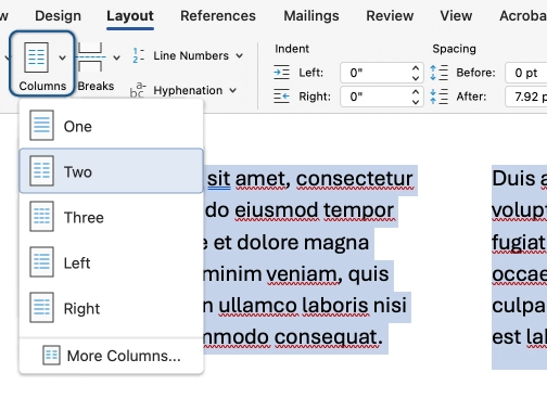
- Select all the content that should appear "wrapped," then in the Layout tab, select Columns, then choose Two. This will create a continuous two-column section within your document. In this example, the section would include the Massachusetts State Seal and the ACCESS Team information.
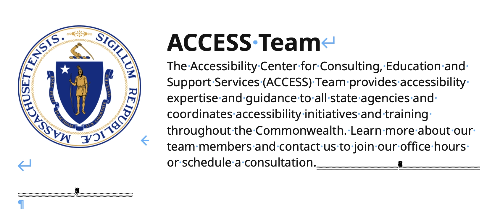
- Place your cursor at the end of the content that should appear on the left. In the Layout tab, select Breaks > Column. In this example, after completing this step, the Massachusetts State Seal appears in the left column, and the ACCESS Team information appears in the right column.
Note: To see section and column breaks more easily, in the Home tab in the Paragraph section, select the paragraph symbol (¶) to show paragraph marks and other hidden formatting symbols.
- Select all the content in the columns again. In the Layout tab, select Columns, then More Columns...
- Adjust the width of each column until it appears the way you want. You may need to uncheck the Equal column width box to create the desired look.
By adding shapes marked as decorative and set to appear behind text, you can also mimic the look of text boxes without disrupting the reading order of the Word document. This technique can work with or without columns.
- Add the content to the main body of your document. Create and adjust columns, if necessary.
- Go to the Insert tab and select Shapes. Choose the shape you will use to mimic the look of a text box and add it to your document.
- In the Shape Format tab, select Alt Text and Mark as decorative.
- In the Shape Format tab, select Wrap Text and choose Behind Text.
- Adjust the position and size of the shape so that it appears the way you want.
- Use a third-party color contrast tool to check the contrast of the text against the background shape color to ensure it meets the 4.5:1 contrast ratio requirement. Note: Shapes behind text are not included in the automated color contrast checks completed by the Microsoft Accessibility Assistant.