

Considerations for using color
Color is often used to convey meaning. Bright colors might be used to get attention, or as an alert or warning. It's important that those colors aren't the only thing conveying meaning in a digital environment. Many users can't see or differentiate colors and screen reader software won't communicate the colors to the user.
It's also important that colors have proper contrast with their background, particularly for text, to make sure that your content is legible for users with low vision or colorblindness.
A real-world example of accessible use of color

Consider a stop sign. Stop signs are one of the most important signs on the road. There are three consistent attributes for a stop sign:
- A bright red color
- The word STOP in white that is in high contrast with the red
- An octagon shape
- Does the image have any meaning at all?
The red draws attention, the word stop is in high contrast and tells you what to do, and the shape is unique from other road signs. If you can't read the word "stop," or can't see the color red, you still have other attributes to rely on to help you understand the meaning.
This exemplifies the two most important concepts for color and accessibility: contrast and not using color alone.
Make sure whenever you use color, whether it's for alerts, status, data visualizations, or other purposes, that color is supplemental to the content.
Color contrast
To ensure text and interactive elements are legible and easily found, these items should have certain color contrast ratios. A contrast ratio is determined by the difference in brightness between two colors. It's not always easy to tell by looking if you've met a contrast ratio, which is why we have a list of colors that work together from the Massachusetts Design System, and tools to test when you are using other colors.
Text should have at least a 4.5:1 contrast ratio with its background, and interactive elements like buttons or icons should have at least a 3:1 contrast ratio.
Color contrast tools
Here are a few free tools to help you check color contrast.
Download the Color Contrast Analyzer from TPGi
In-browser Contrast Checker from WebAIM
Text over colors
The following examples test the contrast of white and black text over a background blue color.



Text over images
Text over an image is often used on websites. This can often be challenging to do accessibly because an image contains many colors. You will need to modify most images to do this successfully. You can darken a whole image or just part of an image to put white text over it. You can also be strategic about text placement.



Avoid using color alone
Color should never be the only thing used to convey meaning. The most common color combination used to mean something is red and green. Ironically, the most common form of colorblindness causes challenges in telling red and green apart - and that is something that affects 1 in 12 men. Low vision and cataracts can also prevent someone from being able to recognize certain colors. This doesn't mean color can't be used, it means we want to ensure that there is an additional indicator to convey meaning.
Make sure whenever you use color, whether it's for alerts, status, data visualizations, or other purposes, that color is supplemental to the content.
Color as an indicator
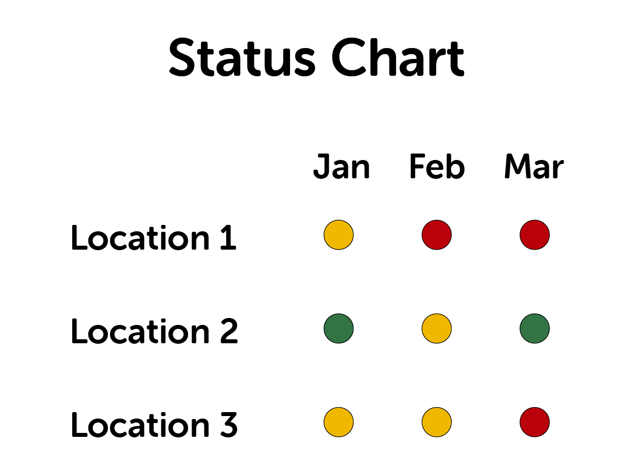
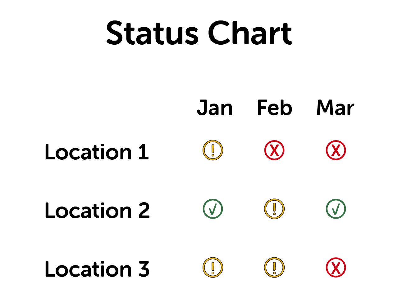
Let's compare examples where color is used. Following are two examples of a status chart. One incorrectly uses color alone, the other correctly uses color as a supplement.
Color as an identifier
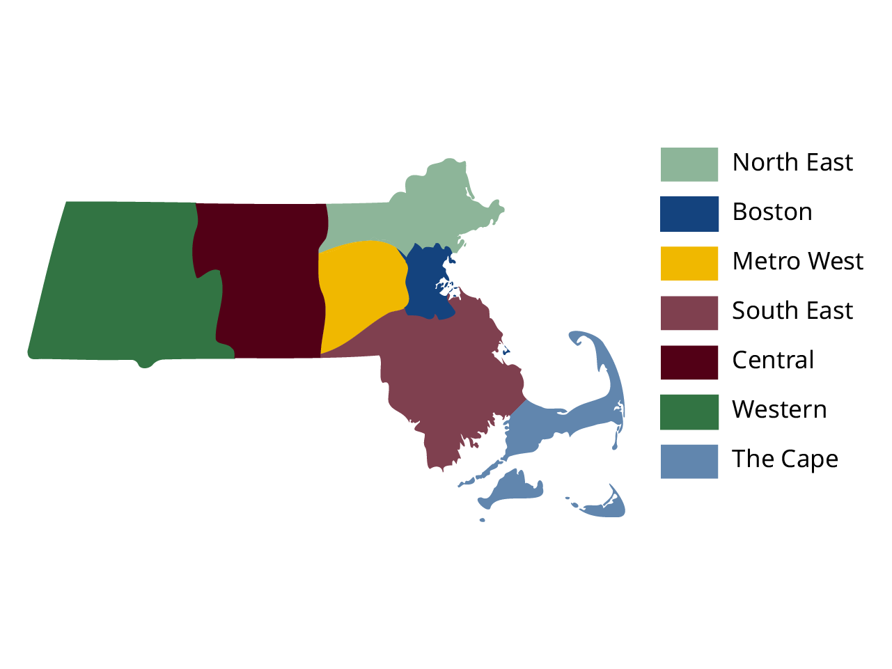
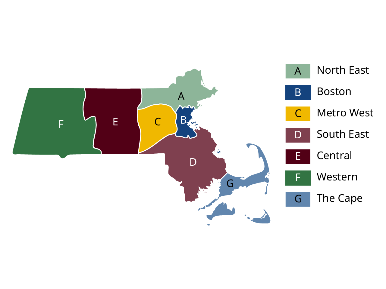
In the case of a visualization like a map, color is often used to identify categories or areas. Color can still be used in this case, so long as there is an additional way to identify the category without the color.
Following is an example of an (unofficial) map of Massachusetts regions with a color-coded legend. The first map uses color alone, the following uses letters as an additional identifier. Letters are not the only way to do this. Shapes, patterns, or arrows connecting the legend to the regions can be used.
Color in data visualization
It is important to be strategic in the way we use color in data visualizations like charts and graphs.
Interactive: Practice identifying good color contrast
In the following interactive practice, review multiple text and color combinations and try guessing which pass and fail. Or use the tools linked after the practice to test the color combinations and know for sure.