
Text content
Text is our simplest form of communication, but it's very easy to make it unclear or even difficult to read based on stylistic choices. A few simple considerations can ensure our text is easily read and accessible.
Abbreviations
All abbreviations should be defined the first time they are used in your content. If you are referring to the Registry of Motor Vehicles (RMV), it's important to state the full name once before using the abbreviation, "RMV." RMV may seem like a very common abbreviation, but it's possible that it could mean other things based on different industries. RMV is also not interchangeable between states, as some states use Division of Motor Vehicles (DMV) or Motor Vehicle Commission (MVC). Never assume an abbreviation is common enough to not spell it out first.
Abbreviations may be announced in varying ways by different screen reader software. Often, screen reader software will try to pronounce the abbreviation as a word. This can be particularly confusing if you are using an acronym that is already another word in the English language. Just because the word DARE is written in capital letters, does not mean that any information will be communicated to a screen reader user that this is in capitals, so it actually means Drug Abuse Resistance Education.
Identify the language of your content
A document or web page should have the language of the content identified. If there are multiple languages in a document, each section should be identified properly. This allows a screen reader to properly pronounce the text on the screen. It also allows text to be translated appropriately by automatic translation tools.
Setting the language in documents
Set the language in a Word document
Setting the language in HTML
To set the language in HTML, first declare the primary language for the entire page, then identify any sections of the page in additional languages.
Code - Declare the language of the page
<html lang="en">
For a passage of text on the page, wrap the text in <span> tags and add the
lang attribute to the span tag.
Code - Declare the language of a passage
<p>The title of the novel is <span lang="fr">Les Misérables</span></p>
Link writing
There are many examples of poorly described links all over the internet. Common incorrect links use phrases like:
- Click here
- Read more
- Learn more
- Download
Why are these bad? It is common for screen reader users to navigate by elements on the page like headings, or links. If a list of links on the page is pulled up and "read more" is announced six times without any context, the user has no idea what they are reading more about. They would have to go to a link, navigate backward and read however much text is before it to figure out the context.
We also want to avoid using entire web address links, as a screen reader user must listen to the entirety of the link.
For example: https://meet.us.com/Q/97973?tk=Qxl
A screen reader user has to listen to every number, letter and character in that link, and will not know where it is going. Instead, we should make our link plain text, and add the link to it. Instead, all links should be descriptive. This can be done in Microsoft Office applications, email, PDFs, web pages, and generally anywhere that you can type text. Links should be phrased to describe the destination such as:
- Learn more about early childhood education
- Find a fishing spot
- Join the accessibility webinar
The following video demonstrates how to add links to text in multiple common applications.
Video: Adding links to text
Sensory characteristics
Sensory characteristics
It is important to not describe things based on a characteristic that requires a specific sense. These characteristics may be shape, position, color or sound. For a screen reader user, the position of an object — up, down, left right — is not clear. Screen readers navigate in a linear fashion — forward and backward. If you call out "the button to the right," that position would not be clear. Instead, we would call out the name of the button. The same would go for the color or shape of the button. Instead, use a word or phrase that describes the name of the item you are calling out.
It is also much more inclusive to not use call-to-action phrases that call out a specific sense or ability. Instead of text like "See what you can do today," or "Listen to the podcast on the town's newest restaurants," use phrases like "Find out what you can do today," or "Discover new restaurants on our latest podcast."
Phrases to use and avoid
| Use | Avoid |
|---|---|
| The submit button | The green button |
| The image in Figure 1 | The image to the right |
| Find, discover, explore | See, hear, listen |
| Select, choose | Click, hover over |
Additional best practices for content
The following considerations are not technical requirements that would result in accessibility failures. However, they are strongly recommended to make your content more usable for everyone.
Plain language
Using plain language and aiming for a 6th-8th grade reading level is helpful in two major ways. First, it means that more people will understand the message you are trying to convey. Second, if your content needs to be translated into other languages, it will be easier and faster if the language is plain.
This is not possible for all types of content. If you are discussing scientific or medical information for example, it may not be easy to simplify. When you can, do your best to make your content simple, clear, and in plain language.
Learn more about plain language (opens in new tab)
Typography and fonts
To make text as legible as it can be, we want to consider several things:
- Text must have proper color contrast with its background
- Avoid using an image of text instead of live text
- Use Sans-Serif fonts for body text (sans serif is easier to read on screens, Serif is fine for headings or titles)
- Base text size should be:
- 12pts (Word)
- 18pts (PPT)
- 16px (Web)
It is also recommended to avoid the use of all capital letters for passages of text. Words have certain shapes to them when spelled in lower case letters. That shape can help people with dyslexia or other reading issues identify words more clearly. It can also make it more challenging for readers whose primary language uses characters other than the Latin alphabet.
Why should you use sans-serif fonts?
Passages in all capital letters
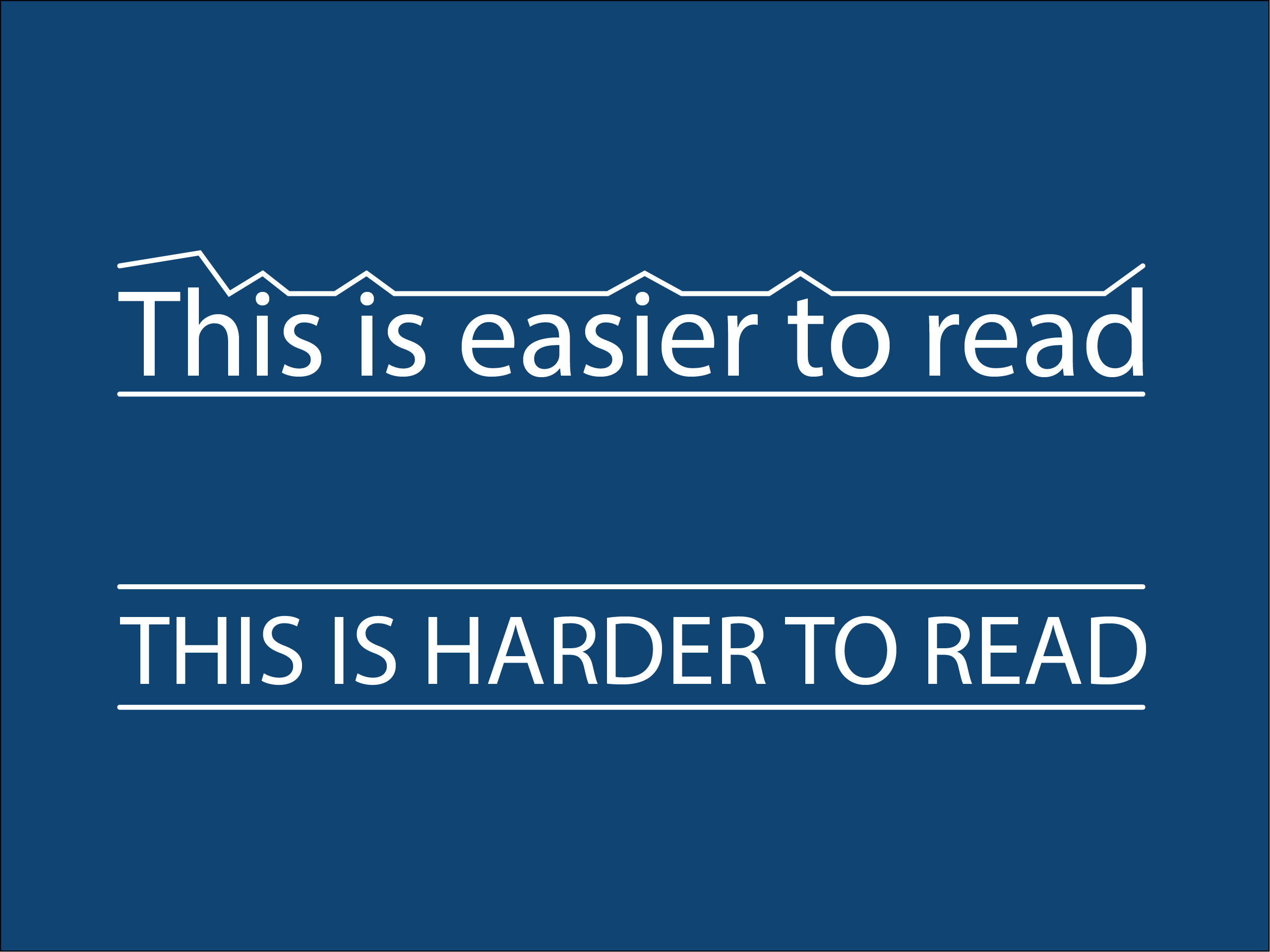
It is also recommended to avoid the use of all capital letters for passages of text. Words have certain shapes to them when spelled in sentence case. The contours if that shape can help people with dyslexia or other reading issues identify words more clearly. It can also make it more challenging for readers whose primary language uses characters other than the Latin alphabet.
There may be requirements to use capital letters in legal language. While use of all caps is not technically an accessibility failure, it makes it harder to read. It is also important to note that the presence of capital letters is not communicated to a screen reader user.