
The challenge with data visualization
Data Visualization helps us understand key trends and takeaways in data. There's not much we can do to make a visualization not visually biased, so we need to make sure that there are alternatives to these visuals that convey the meaning that the visualization illustrates. Data visualization can present many challenges depending on the type of disability. The type of challenge will vary based on whether the visualization is static, like an image or PDF, or if it is interactive, like a dashboard. The following information includes some strategies for more accessible visual design, descriptions and alternatives for static charts, and recommendations for when building interactive visualizations with tools like PowerBI, Tableau, or custom development using libraries like Highcharts.
Lighten the cognitive load
If a chart looks confusing visually, there are many people who may have a hard time interpreting the data. This can be even more difficult for someone using a screen reader. Building a mental model of a visualization from hearing a description is challenging enough, not to mention if the chart is already visually challenging. Do your best to simplify the presentation of the data, or consider breaking it down into chunks.
As the person creating the chart, you will have more insight into the data. If you have high data literacy, a complex chart might make sense to you, while not to others. Try to view your visualization as if you have no knowledge of the data just like the people who will be consuming your content.
Consider multiple visuals for different aspects of the data, instead of attempting to combine all information into one chart by increasing the colors, symbols, or segments in the chart.
Example: Simplifying a bar chart
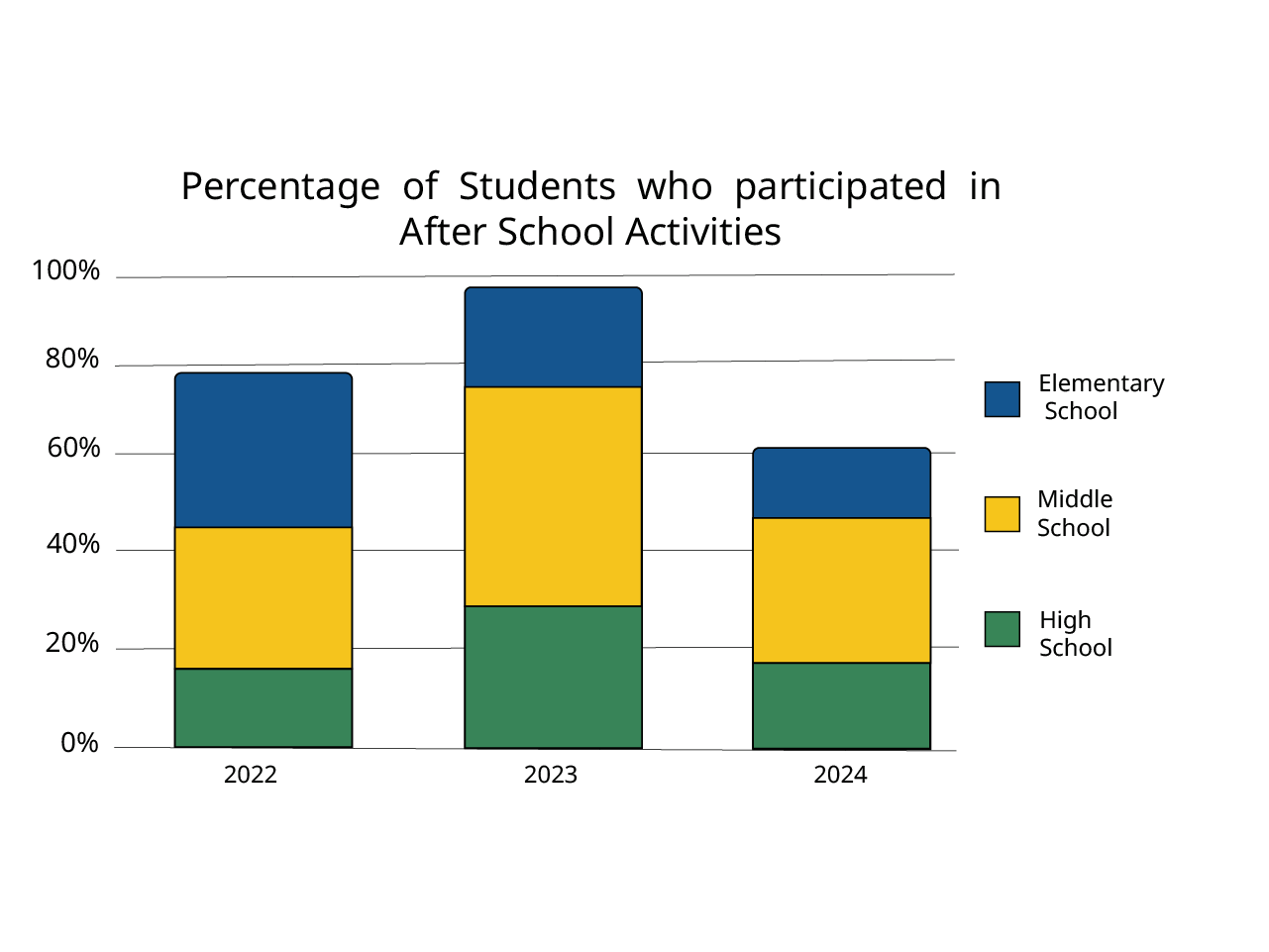
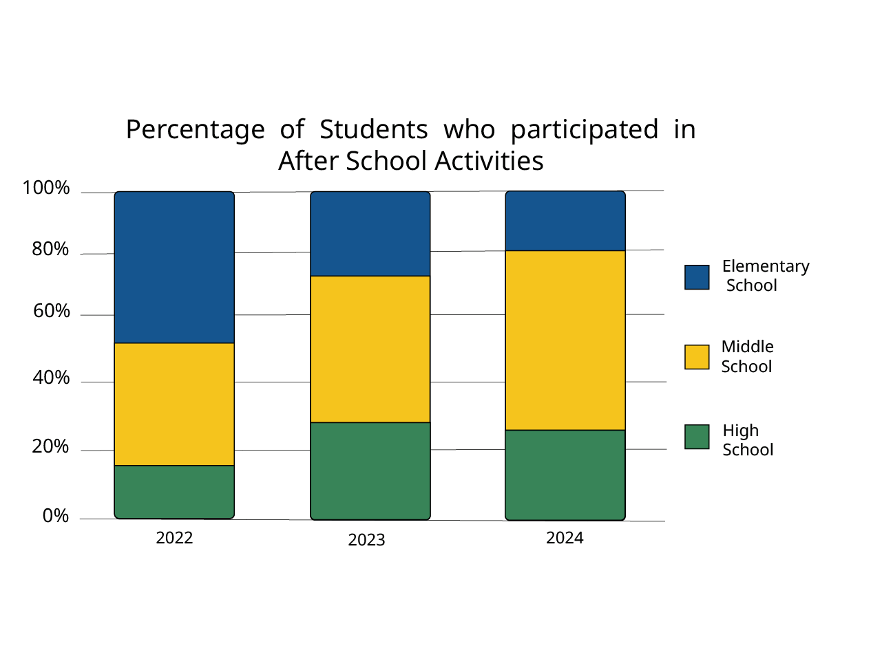
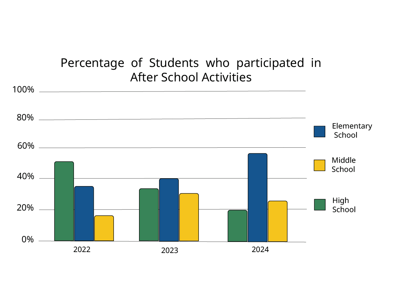
For example a segmented bar chart can be useful when demonstrating changes in the percentage of something that is a part of a whole. But if the amount of each of the bars is not a divided 100%, it can be harder to understand the percentages each segment makes up visually. If the values are what is more important, then separating those segments into their own bars will be easier to understand. A better way to present this data more clearly, would be to separate each segment out into its own bar. This makes values more clear for each category.
Try not to focus on how data may have been presented previously, consider having multiple ways to view data, and look for opportunities to make what is being presented as obvious as possible.
The following examples show some steps that could be taken to reduce cognitive load in a presentation of three segments of data. These examples contain additional accessibility issues, like missing labels, that will be addressed after this section.
Use of color and identification
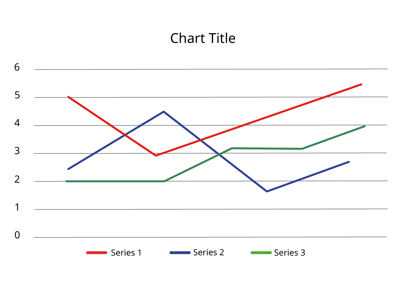
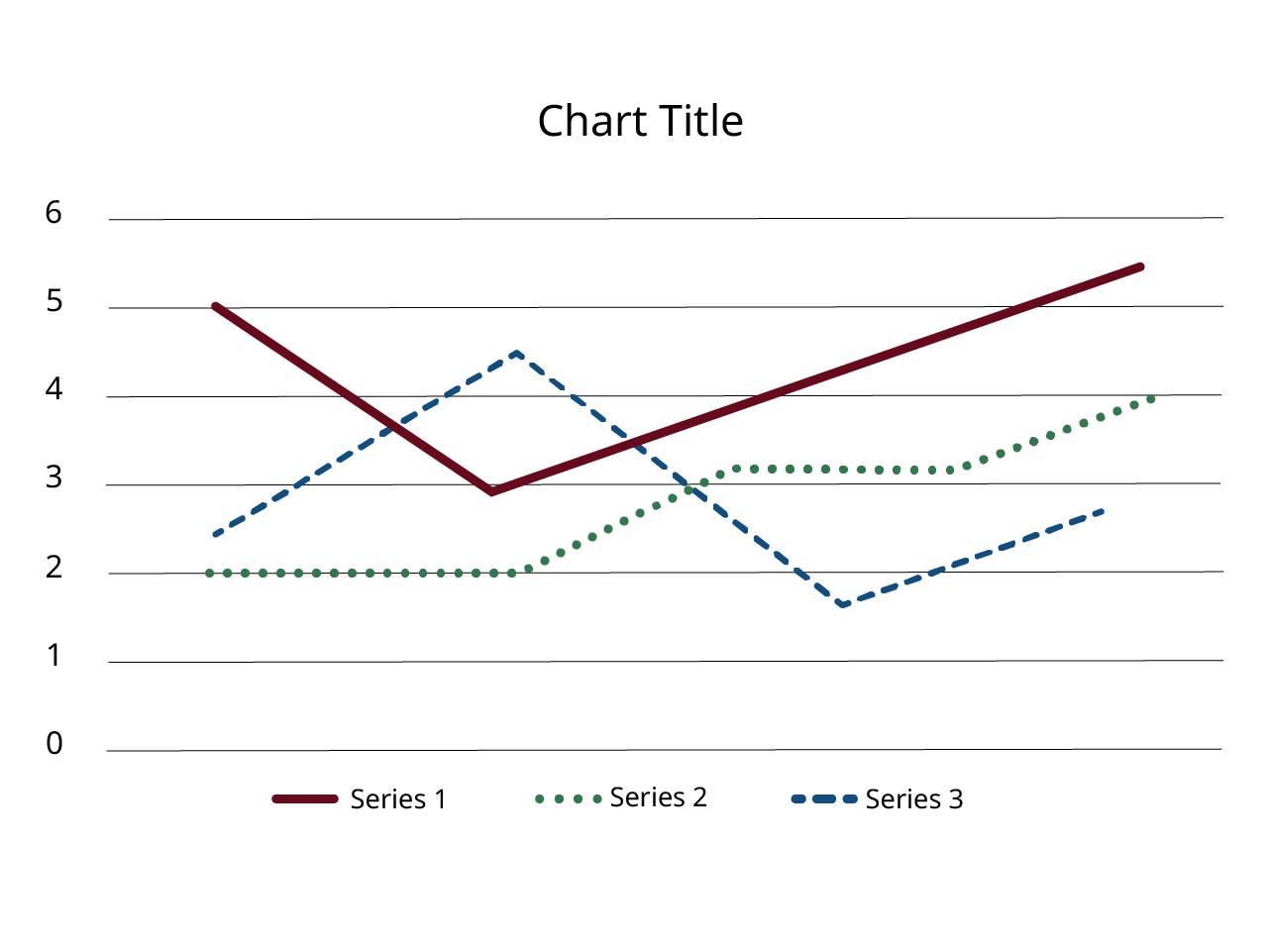
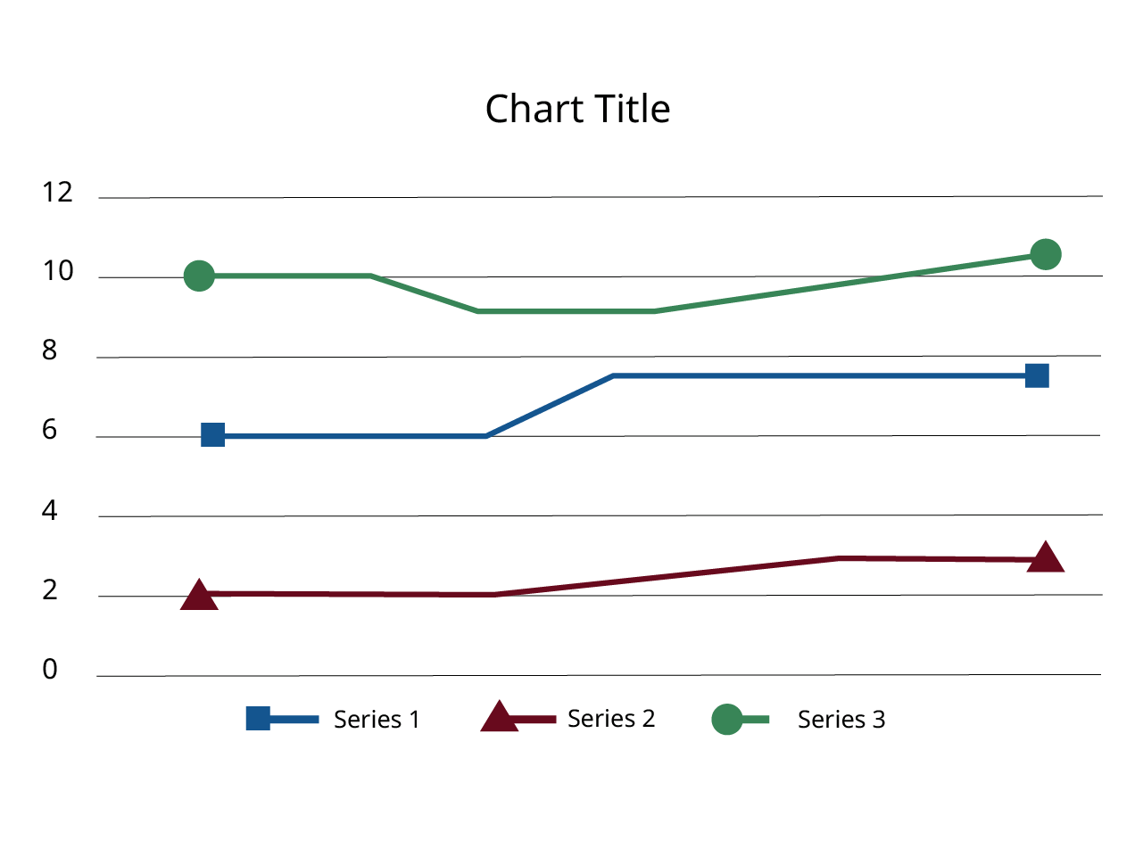
Charts, like the previous examples, often use color alone to identify categories of data. Using color in a chart is fine, but we can't use it by itself to identify something. Also, chart colors should have at least a 3:1 color contrast with the background, or have a border around the segment that is high contrast. Colorblind, low vision, and blind users will have difficulty identifying colors in the chart, particularly when trying to compare them to a legend. Having a chart that includes patterns, shapes, symbols, text or numeric labels will make it much easier for users with visual impairments to identify the data in your chart. Let's review several helpful options.
Use of patterns or shapes
If you have simple charts, patterns can be a way to make your chart more accessible, as they allow someone to identify differences without needing to see difference in color. Using too many patterns can be visually distracting, so it is not recommended for complex data sets.
For more complex data sets in line graphs, shapes can be used to help identify the difference between lines. These would also be placed at each data point in an interactive chart, as a way to select that data.
Use of symbols
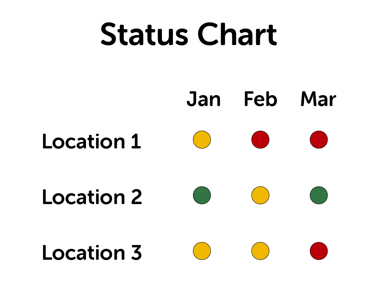
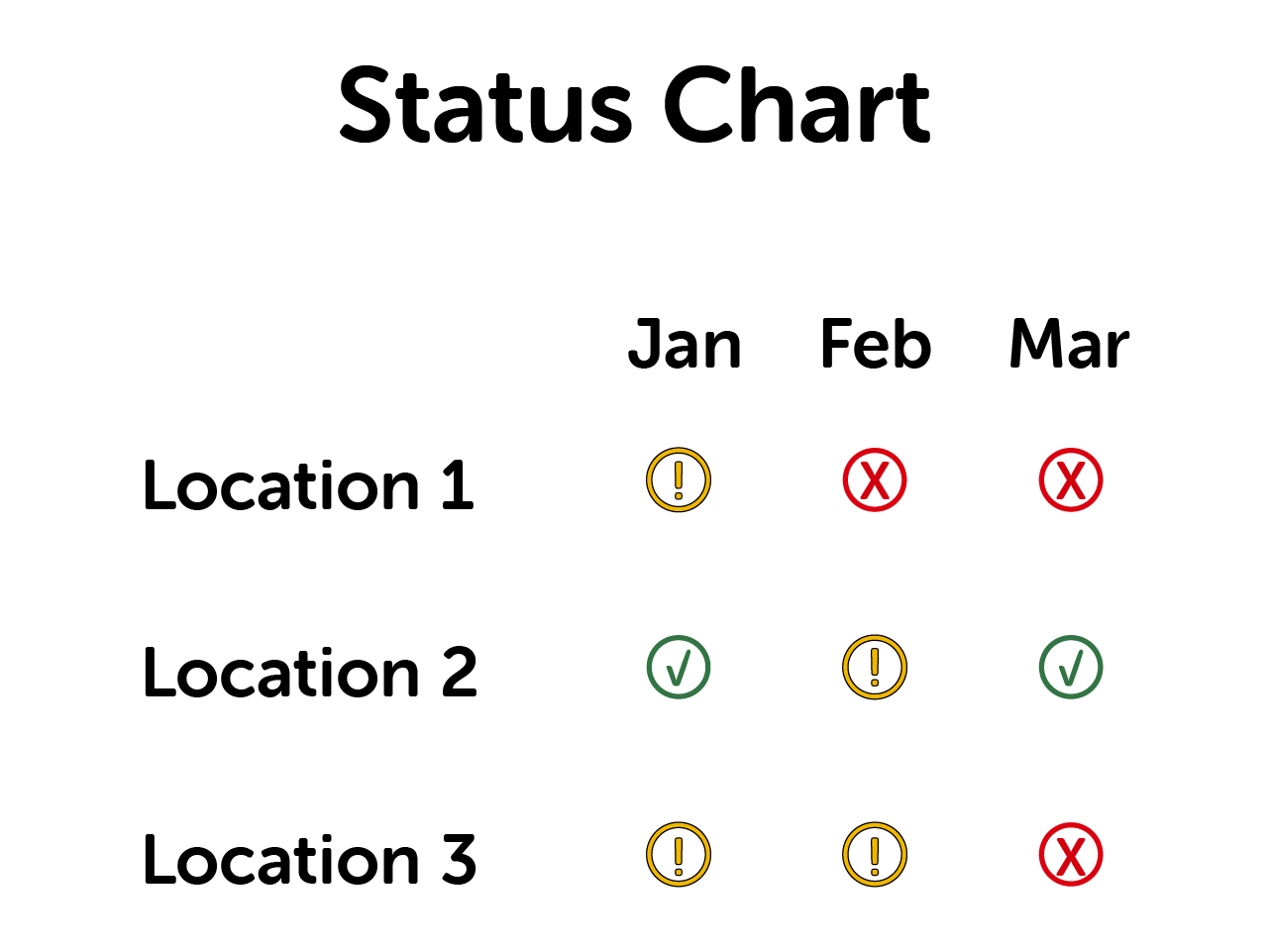
The following example shows a status chart with green, yellow and red circles indicating status. While this process is very common, red/green colorblindness is the most common form of colorblindness, so the pairing of these colors for meaning creates challenges. Adding symbols to the chart is another way to not use color alone. If this chart was interactive, the symbols used here would need alt text to communicate meaning to a screen reader user.
Labeling charts (the best option)
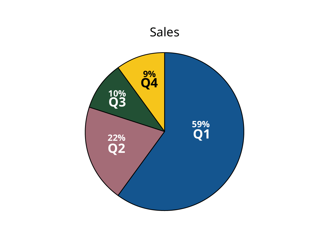
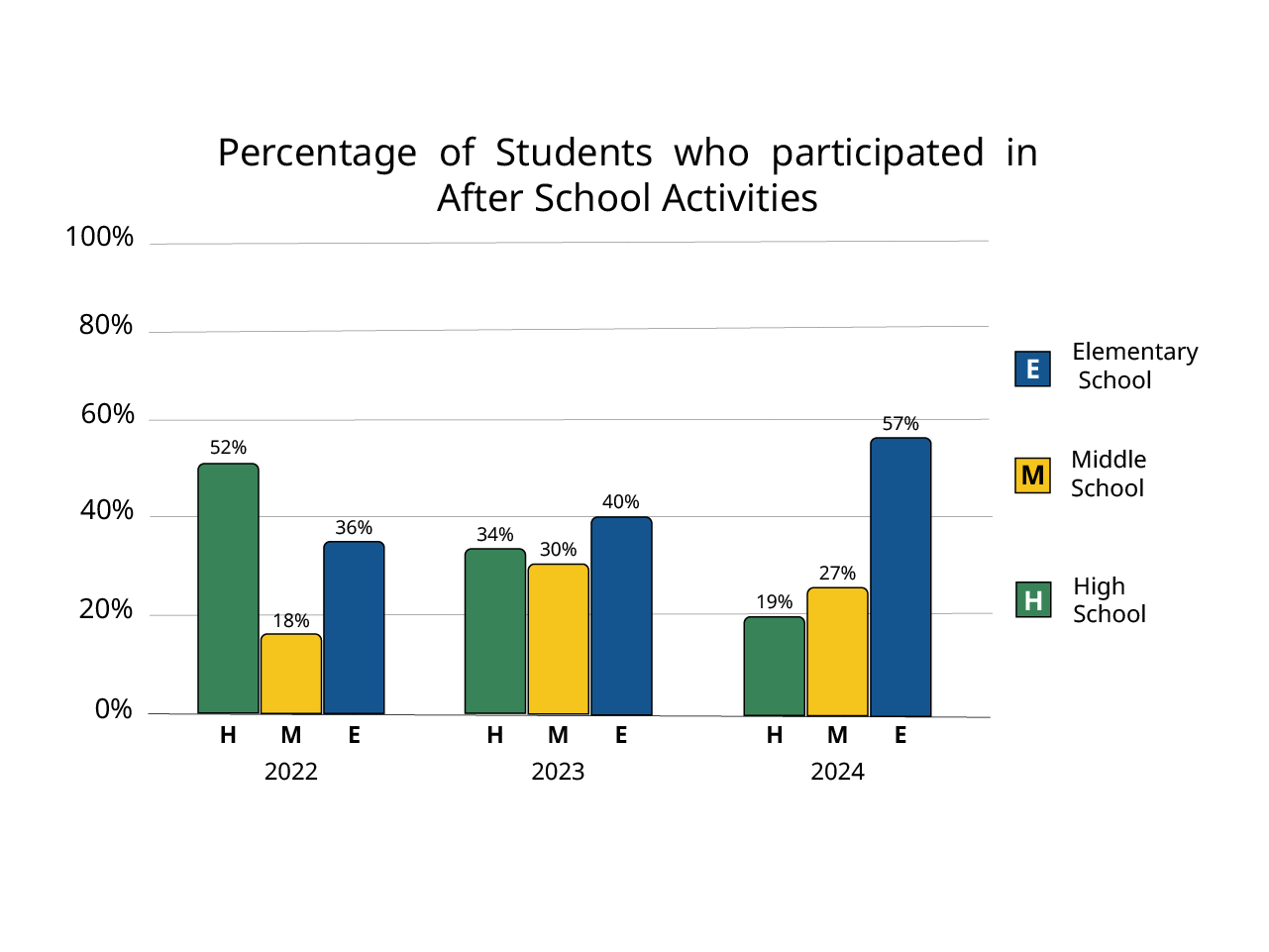
Labeling charts is the best way to make them accessible visibly. While we can increase understanding and identification with shapes and patterns, having actual labels in a chart is optimal, and should be done whenever possible. Removing a legend and having direct labels can make a chart look cleaner. Chart labels should identify the category, and if the value is not clear, consider adding value labels as well.
Charts should always have a title associated with the chart. If a chart is in a Word document or PDF, those titles should be headings above your chart. You should also make sure that you provide a table title in Word. If your title is in your graphic (like the following examples) you will need to include that information in your alt text. Since we always want to keep alt text short, including the title information can potentially take up a lot of your alt text.
Following are some examples of labeled charts.
Use of numbers
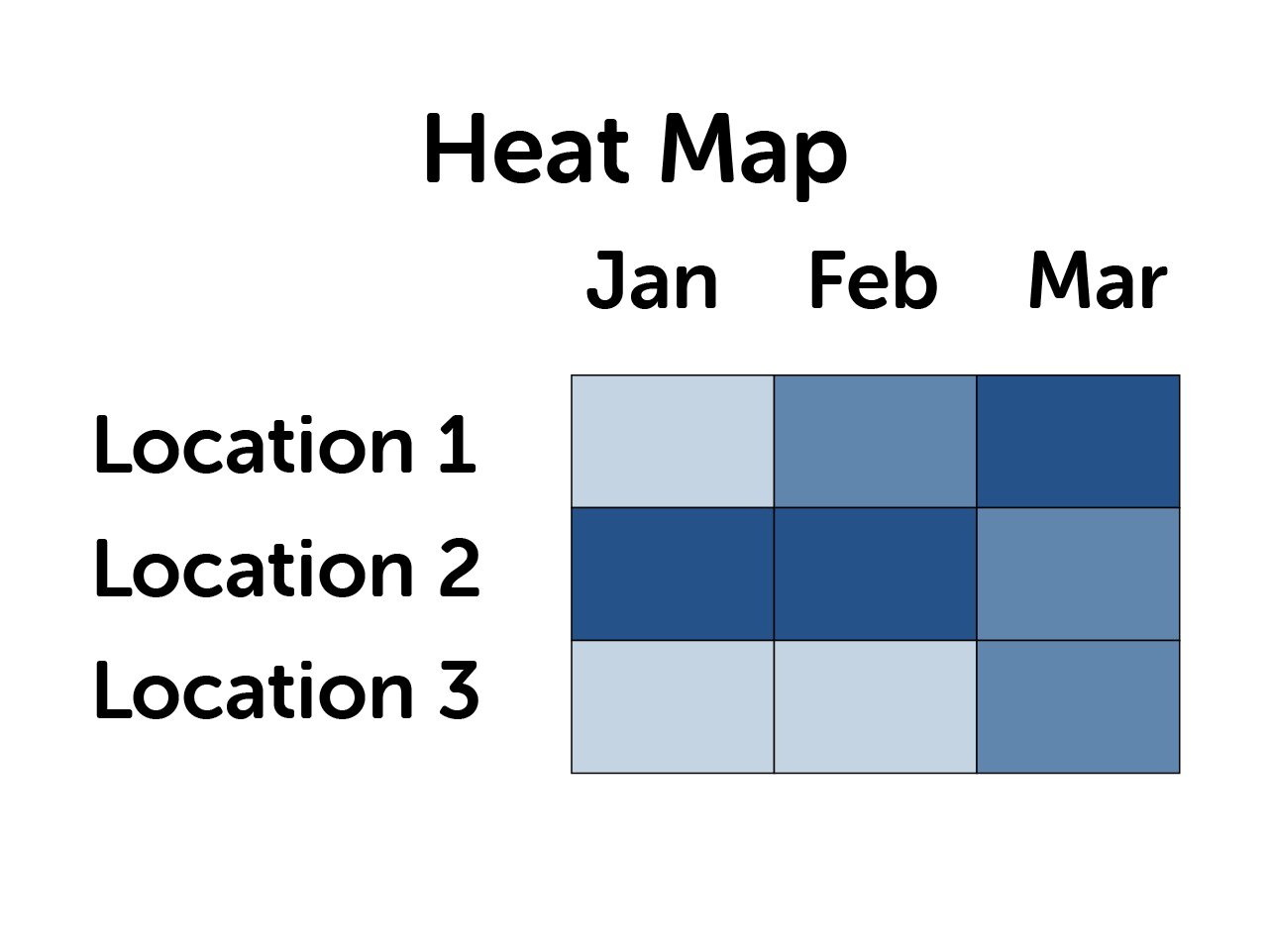
A heat map is a popular way to display status in a dashboard, that may have a range of colors used. In this case, it may be more difficult to identify many grades of status with symbols or shapes. Using a numeric scale to identify severity in this sort of chart will be helpful. It is also helpful to stick with one color, and use shades of that color to determine severity, rather than using many different colors.
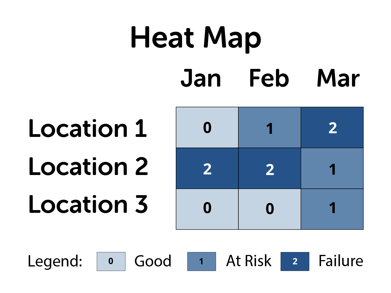
Describing charts
The purpose of a chart is to understand the data better, so we need to present that understanding as a summary or alt text. A summary, such as a few lines of text below a chart, can be helpful for everyone, especially if the chart is complex. This will make sure the chart viewer understands what takeaway you are intending to convey. If your chart is very complex, a long description, such as a paragraph, should accompany the chart, or a link to that description can be added.
Alt text describing a chart should not contain all of the values within the chart. It is not meant to deliver all of the data, but to describe a trend or key takeaway from the chart - whatever the visual helps you understand, as opposed to a detailed description of the data itself. A description of the data should be delivered in a table that accompanies the chart, which will reviewed in the next section.
A good formula to think about alt text for a chart is:
Formula: "Chart type of type of data where chart takeaway."
Example: "Line graph of unemployment numbers where unemployment decreases from 2020 to 2025."
Following are some examples of chart alt text.
Table alternatives
A table alternative to your chart containing the data must always be available. This is important with static charts, but also as an alternative to navigating an interactive chart in a dashboard. Chart data is too much detail to put into alt text, so we need to provide a table alternative to present the data. A table should never be an image, but must be an actual table in the document or webpage. Screen reader users can navigate a table and hear the contents of each cell, and its relationship to other cells in the column or row.
If you have a complex visualization like a map, the only way a screen reader user is going to be able to get the data is from a table. For large tables of data like this, ensure that the table can be sorted and filtered.
Tables alternatives in a Document
If you are creating a document from scratch, you can add a table in to a document directly on the page near your chart if it is appropriate. But if you are modifying an existing document, or will not have the room on the page to place the table, you can add the table to an appendix at the end of your document. Then place a link below your chart that takes the viewer to the appendix at the end of the document.
When creating a table in a Word or PDF document, be sure to mark up your table correctly. To learn more about adding accessible tables, review our guides on Word or PDF documents.
Learn about tables in Acrobat Pro
Tables alternatives in Web Pages
If presenting your chart and table on a web page, there are several techniques you can use to do this. If you are custom developing a web page, one common technique is to use tabs to switch between a chart and table view. You can also place the table and chart next to each other, or one following the other.
Following is an example of presenting an image chart with description along with a table, using the previous pie chart example.
Example: Sales numbers 2024
| Date | Profit (in millions) | Percent |
|---|---|---|
| 1st Quarter | $8.2 | 59% |
| 2nd Quarter | $3.2 | 22% |
| 3rd Quarter | $1.4 | 10% |
| 4th Quarter | $1.2 | 9% |
Exception to table alternatives
If you are using a visualization in an infographic where the viewer is not meant to get actual data from the image, and it is simply a design choice, you may not need to provide a table alternative. Following are some examples.
Example: Infographic map
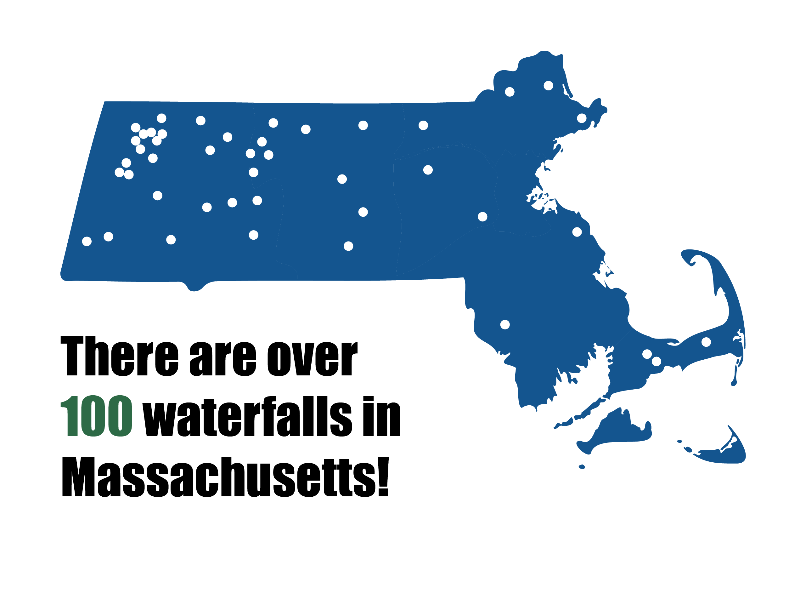
In an infographic called "Waterfalls in Massachusetts" shows a small map of Massachusetts with many point of interest dots on it. Under the map is text that reads "There are over 100 waterfalls in Massachusetts." Since there is no way for anyone to interpret exactly where the waterfalls are, and the only purpose was to have a design that shows many points, a table wouldn't be needed. The only information being conveyed is that there are over 100 waterfalls. That text should be on the page and selectable in a PDF or webpage. However, if the point of the map was to show exact locations, and that information visually available, a table would be needed to list those locations.
Example: Infographic chart

In this infographic example, there are 4 bars to represent a chart showing favorite US ice cream flavors. But the bars of the chart aren't really accurate, they are just visually reinforcing the order of most to least. There is text on the page saying 40% Vanilla, 30% Chocolate, 20% Strawberry, and 10% Butter Pecan. That is the only information that is being conveyed. So long as those percentages are text on the page that a screen reader user could get to, there's no reason for a table alternative with that data, and the graphic of the bars could be marked as decorative, and wouldn't need alt text.
Dashboards
If you are creating dashboards with a tool like PowerBI or Tableau, be aware that there will be some accessibility limitations. Just because a feature is available in the tool, does not mean that feature is guaranteed to be accessible. You may need to consider alternative presentations.
If you are developing a custom dashboard with a library like Highcharts, be sure to install any accessibility modules that come with the library, and be aware that there may be some custom development to add functionality.
Either way, building a dashboard is essentially creating an entire web page, and it should be run through the web testing checklist.
Dashboard considerations
- Data overlays
- Do not use overlay layers in PowerBI or Tableau. These layers are typically unreachable with a keyboard or screen reader, or will be out of context with the map or chart.
- Filtering
- Keep filtering processes simple. Complex nested components like checkboxes or radio buttons within drop-down menus will need to be tested with a keyboard and screen reader. Opt for search filters or different drop-downs for different aspects of data.
- Hover
- If your interactive chart shows additional data on hover, ensure that data also shows on keyboard focus with the TAB key, and that it is reachable with a screen reader. Do not hide important information in a hover state, and instead use that for supplemental info.
- Instructions
- If there are any interactions or requirements to use features in your dashboard, provide on-screen instructions. Inform users that they can press the question mark (?) key to bring up a list of keyboard shortcuts in Power BI reports.
- Responsiveness
- Your dashboard should be responsive to different devices. Not only does responsiveness affect mobile devices, it also ensures content will reflow properly when browser zoom is used.
- Tab or reading order
- All interactive elements should be reachable with the TAB key on the keyboard, and show a visible focus ring. Text and headings should not be in the tab order. Tab order should be top to bottom, left to right.
- Table alternatives
- Even if your chart has interactive elements, be sure to offer a table alternative. That table should have sorting functionality, and if it is a large table, filters.
- Targets
- Ensure that any items meant to be clicked with a mouse are at least 24px by 24px. Ensure that any items meant to be tapped on mobile are at least 48px by 48px.
Additional dashboard resources
Build accessible dashboards with Tableau
Design Power BI Reports for Accessibility
Maps
Static maps follow the same principles as other data visualizations: good color contrast, labels, a description and a list or table alternative is needed. Interactive maps have additional considerations like search and filtering, so that you can access the data in the map in a non-visual way.
Static Maps
Often static maps in a document or on a web page are closer to a decorative image than a functional one.
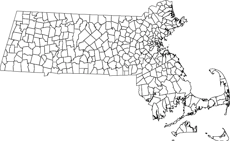
For example, if a map shows the outlines of municipalities in a state, it is unlikely that anyone would be able to identify the name of every municipality simply by looking at dividing lines. If this was used on the title page of a document about Massachusetts municipalities, it is more decorative, as it is not communicating information like municipality names or sizes. In this case, we would provide an alt text description such as:
"A map of Massachusetts with dividing lines on municipal boarders."
However, if your map image contains points of interest that are a list of locations, then you'll need to provide a list or table alternative with that information in it.
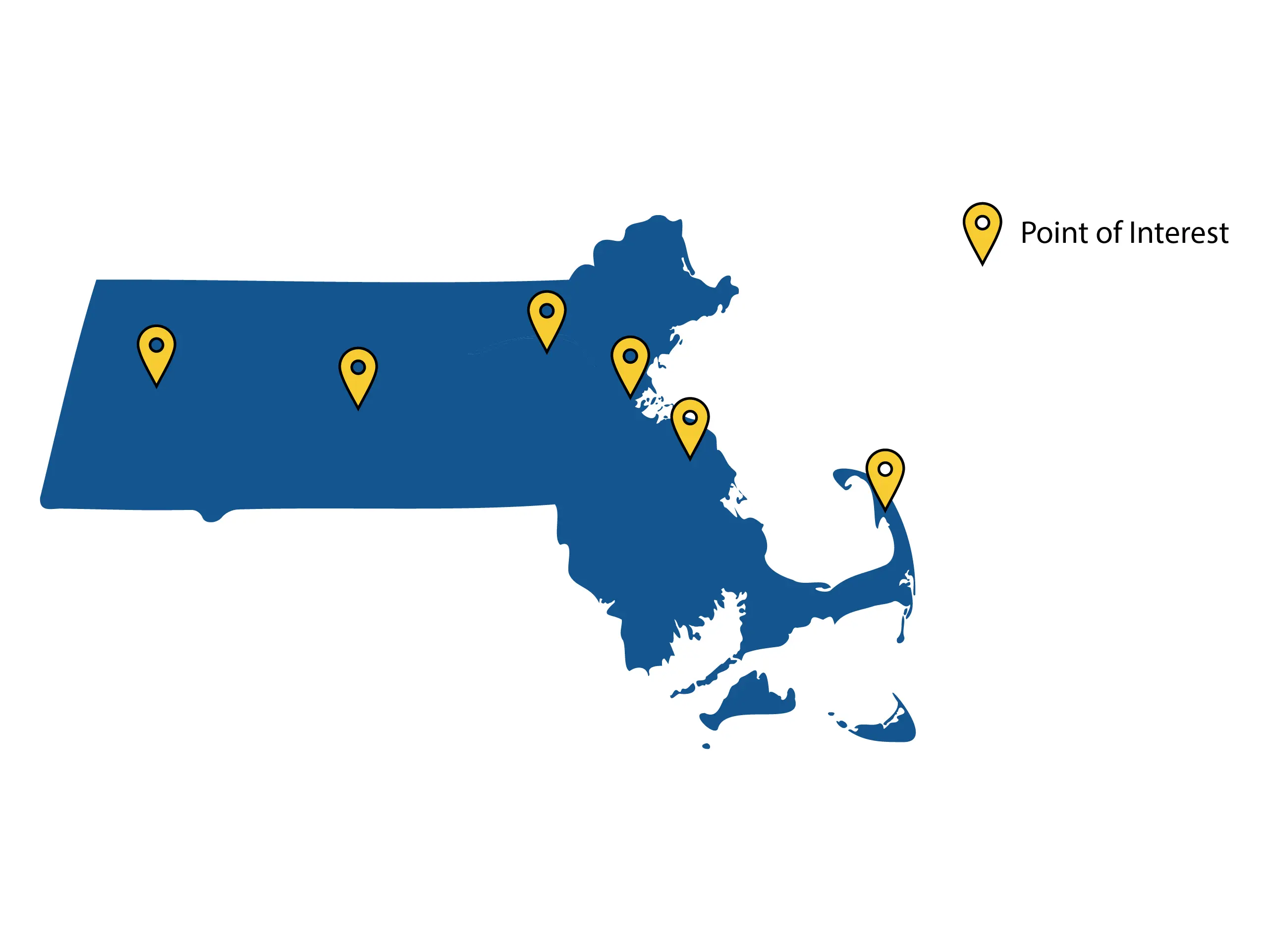
This map example contains points of interest. Typically a map showing points of interest is being used to communicate what those points are, and how to get to them. In this case, we would provide an alt text description, as well as a text alternative. If municipality names are all that is needed, a list will suffice. If you wanted to provide name, address, and contact info, a table alternative is better. If your map is highlighting regions, and you have an accompanying paragraph discussing each region and the reasons they are highlighted, that is also an acceptable alternative which would be considered a long description.
Example text alternatives for this map
Depending on the purpose of the map, and what information you are trying to communicate, different text alternatives such as a list, a table, or a long description may be appropriate.
A List:
- Boston
- Holyoke
- Lowell
- Quincy
- Wellfleet
- Worcester
A table:
| Location | Address | Information |
|---|---|---|
| Boston | 1 Ashburton PL | Additional info |
| Holyoke | 563 Dwight St | Additional info |
| Lowell | 375 Merrimack St | Additional info |
| Quincy | 1305 Hancock St | Additional info |
| Wellfleet | 300 Main St | Additional info |
| Worcester | 455 Main St | Additional info |
A description:
A description for this map might read, "This map highlights the six Massachusetts cities of Boston, Holyoke, Lowell, Quincy, Wellfleet, and Worcester," and then continue to provide context of why those points of interest are being highlighted.
Interactive Maps
For interactive maps, review the guidance created by our Geographic Information Systems (GIS) specialists in the Executive Office of Energy and Environmental Affairs.